Subtitles on social media are not just about readability — they are a design element that directly affects how viewers perceive and engage with your content. The difference between default platform captions and a well-styled subtitle overlay can mean the difference between a viewer scrolling past and watching to the end.
This guide breaks down the specific subtitle styles, fonts, colors, animations, and positioning strategies that perform best on TikTok, Instagram Reels, and YouTube Shorts in 2026. Every recommendation is grounded in what top-performing creators and brands are actually using.
Why Subtitle Styling Matters
When most people think about subtitles, they think about making spoken words readable. But on social media, subtitles serve a dual purpose: they convey information and they establish visual brand identity. A creator who uses a consistent, recognizable subtitle style becomes instantly identifiable in the feed, even before the viewer reads the text or hears the audio.
Styled subtitles also increase watch time. Animated text draws the eye and holds attention, turning passive scrolling into active reading. Platforms reward higher watch time with broader distribution, which means your subtitle styling has a direct line to your reach.
The Five Core Subtitle Styles
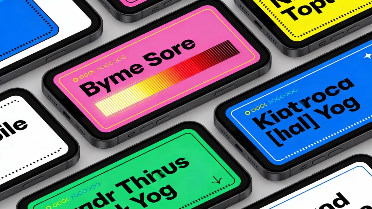
1. Bold Center Block
This is the most popular subtitle style on social media. Text appears in a large, bold, sans-serif font centered on screen, typically one to three words at a time. The text is usually white or a bright accent color with a dark drop shadow or outline for contrast.
Best for: Talking-head videos, motivational content, storytelling.
Why it works: The large text is impossible to miss, and showing only a few words at a time creates a rhythmic, punchy reading experience.
Font choices: Montserrat Bold, Impact, Bebas Neue, or any heavy-weight grotesque sans-serif.
2. Karaoke / Word-by-Word Highlight
Text displays a phrase at a time, and each word highlights in a contrasting color as it is spoken. This creates a reading experience similar to a karaoke prompter, guiding the viewer's eye through the subtitle in sync with the audio.
Best for: Educational content, tutorials, podcast clips, anything where following along precisely matters.
Why it works: The moving highlight adds a layer of animation that holds attention without being distracting. It also improves comprehension because the viewer is guided word by word.
Color approach: White or light gray text with the active word highlighted in yellow, green, or the brand's accent color.
3. Boxed / Background Panel
Each subtitle line sits inside a semi-transparent colored rectangle. This style borrows from traditional broadcast captioning but adapts it for mobile with bolder colors and rounded corners.
Best for: Busy or visually complex backgrounds where plain text would be hard to read.
Why it works: The background panel guarantees readability regardless of what is happening in the video behind the text.
Design tip: Use a semi-transparent black (70-80% opacity) or a bold brand color at 60% opacity. Round the corners for a modern feel.
4. Pop-Up / Bounce Animation
Words or phrases pop onto the screen with a bounce, scale, or slide animation, adding kinetic energy to the subtitles. This style is common in high-energy content like comedy, hype videos, and trend-based content.
Best for: Entertainment, comedy, reaction content, fast-paced edits.
Why it works: The movement attracts attention and matches the energy of dynamic content. It makes the subtitles feel like part of the video's creative direction rather than a utilitarian overlay.
Caution: Overusing heavy animations on slower, educational content can feel jarring. Match the animation intensity to the content's energy.
5. Minimal Lower-Third
A clean, small-font subtitle pinned to the lower third of the screen. This style is subtle and stays out of the way of the visual content, resembling traditional film subtitles.
Best for: Cinematic content, travel videos, aesthetic vlogs, brand content that prioritizes visuals.
Why it works: It adds accessibility without competing with the imagery. The understated design signals polish and professionalism.
Font choices: Clean sans-serifs like Inter, Helvetica Neue, or SF Pro at medium weight.
Create videos like this with AI
Script, voiceover, images and subtitles — automated in minutes.
Color Strategy for Subtitles
Color is one of the most overlooked elements of subtitle design. Here are the principles that work across platforms:
High contrast is non-negotiable. If your text does not pop against the background, viewers will not read it. White text with a black outline (2-3px stroke) works on nearly any background.
Use your brand color sparingly. Reserve your accent color for the highlighted or emphasized word, not the entire subtitle. This creates a focal point without reducing readability.
Avoid pure red on pure blue (or vice versa). These combinations cause chromatic aberration on compressed video, making text appear to vibrate or blur.
Test on mobile. Colors that look distinct on a desktop monitor can blend together on a phone screen in bright sunlight. Always preview your subtitle colors on a physical device.
Font Selection Guide
The font you choose for subtitles communicates tone before the viewer even reads a word. Here is a framework:
Bold sans-serifs (Montserrat, Poppins, Bebas Neue): Energetic, modern, confident. The default choice for most social media content.
Rounded sans-serifs (Nunito, Comfortaa, Quicksand): Friendly, approachable, casual. Works well for lifestyle and wellness content.
Condensed/narrow fonts (Oswald, Barlow Condensed, Anton): Space-efficient, impactful. Great when you need to fit longer phrases on screen.
Serif fonts (Playfair Display, Lora): Elegant, editorial. Use for luxury brands or storytelling content where sophistication matters.
Positioning and Safe Zones
Where your subtitles appear on screen matters more than you might think. Each platform overlays its own UI elements — like buttons, usernames, captions, and interaction icons — on top of your video. If your subtitles collide with these elements, they become unreadable.
TikTok Safe Zone
TikTok places the username, caption text, and music label on the lower 20-25 percent of the screen. Interaction buttons (like, comment, share) sit on the right side. Place subtitles in the center or upper-center of the screen to avoid conflicts.
Instagram Reels Safe Zone
Reels has a similar layout to TikTok, with the username and caption at the bottom and action buttons on the right. Center positioning works best. Avoid the bottom 15 percent and the right 10 percent.
YouTube Shorts Safe Zone
Shorts displays the channel name, title, and action buttons along the bottom and right. The bottom 20 percent is the most cluttered zone. Upper-center or true-center positioning is safest.
For a deep dive into the technical side of subtitle generation, including how AI handles timing and segmentation, refer to our complete AI subtitles guide.
Platform-Specific Style Recommendations
TikTok
TikTok audiences expect high energy and visual flair. The karaoke highlight style and pop-up animations perform best. Use bold, large fonts and do not be afraid of bright colors. TikTok's native caption tool has improved, but third-party tools offer far more customization and brand consistency.
Instagram Reels
Reels tends to skew slightly more polished than TikTok. The bold center block and boxed panel styles are the most popular among top-performing Reels. Brands that maintain a consistent Instagram aesthetic should match their subtitle colors to their grid's color palette.
YouTube Shorts
Shorts attract a wider demographic range, including viewers who are accustomed to traditional YouTube content. Clean, readable subtitles work best here. The bold center block or minimal lower-third styles are safe choices. Avoid overly flashy animations that might feel out of place for educational or informational content.
How to Build a Consistent Subtitle Brand
The most recognizable creators on social media have a subtitle style that is uniquely theirs. Here is how to develop yours:
Choose one style and stick with it. Consistency builds recognition. Viewers should be able to identify your content from the subtitles alone.
Create a preset. Most subtitle tools let you save your font, color, size, animation, and position as a reusable preset. Set it up once and apply it to every video.
Align with your overall brand. Your subtitle style should feel like a natural extension of your brand identity. If your brand is minimalist, do not use bouncy neon subtitles. If your brand is energetic and bold, do not use thin, quiet text.
If you are comparing auto captions versus manual subtitles, keep in mind that most auto-caption tools now offer rich styling options that previously required manual editing, making the choice easier than ever.
Final Thoughts
Subtitle styling is one of the easiest ways to elevate the perceived quality of your short-form video content. The right font, color, animation, and position can boost watch time, strengthen brand recognition, and make your content accessible to a wider audience. Treat your subtitles as a design decision, not an afterthought, and they will pay dividends across every video you publish.